From a one-off booking app to an ongoing pregnancy companion
I led the design of Motherhood's Maternity experience, extending an appointment-booking app into a monthly paid pregnancy service that stays useful across pregnancy.
Reported outcomes
Reported product metrics, within four months of launch:
The opportunity: support beyond an appointment
Motherhood cared for thousands of pregnant patients, but it had no app to support them through pregnancy. The one app it ran was built largely for appointment booking, and even that did not work reliably. I redesigned that booking experience first, then we built the dedicated Maternity vertical.
A maternity organisation had no maternity app. Thousands of pregnant patients, and nothing to support them across pregnancy, between one appointment and the next. That absence, not the booking screen, was the real opportunity.
This changed the product's role: from a utility used for a single transaction to a service designed to stay useful between appointments.
My contribution: connecting clinical expertise and product delivery
I worked directly with the founder/CXO and interviewed doctors to understand the clinical input the experience needed. Doctors tested prototypes and gave feedback as the designs developed, and their involvement went well beyond reviewing screens.
- Doctors supplied the dietary items for different patient types and prepared the underlying activity content.
- Two Motherhood doctors certified in yoga volunteered for the team's original pregnancy exercise videos, recorded with professional videographers, audio equipment and a dedicated space.
My job was to translate that expertise into a coherent consumer experience: what users saw, how guidance was organised, how they could act on it and where professional support stayed accessible. I also worked hands-on in Strapi, uploading and organising the content and images behind the screens.
What the market was missing
Before I designed anything, I subscribed to and tore down the leading maternity and fertility apps, capturing hundreds of screens across onboarding, week-by-week tracking, nutrition, content, community and paywalls. I wanted to see what the category already did well, and where it left a gap.
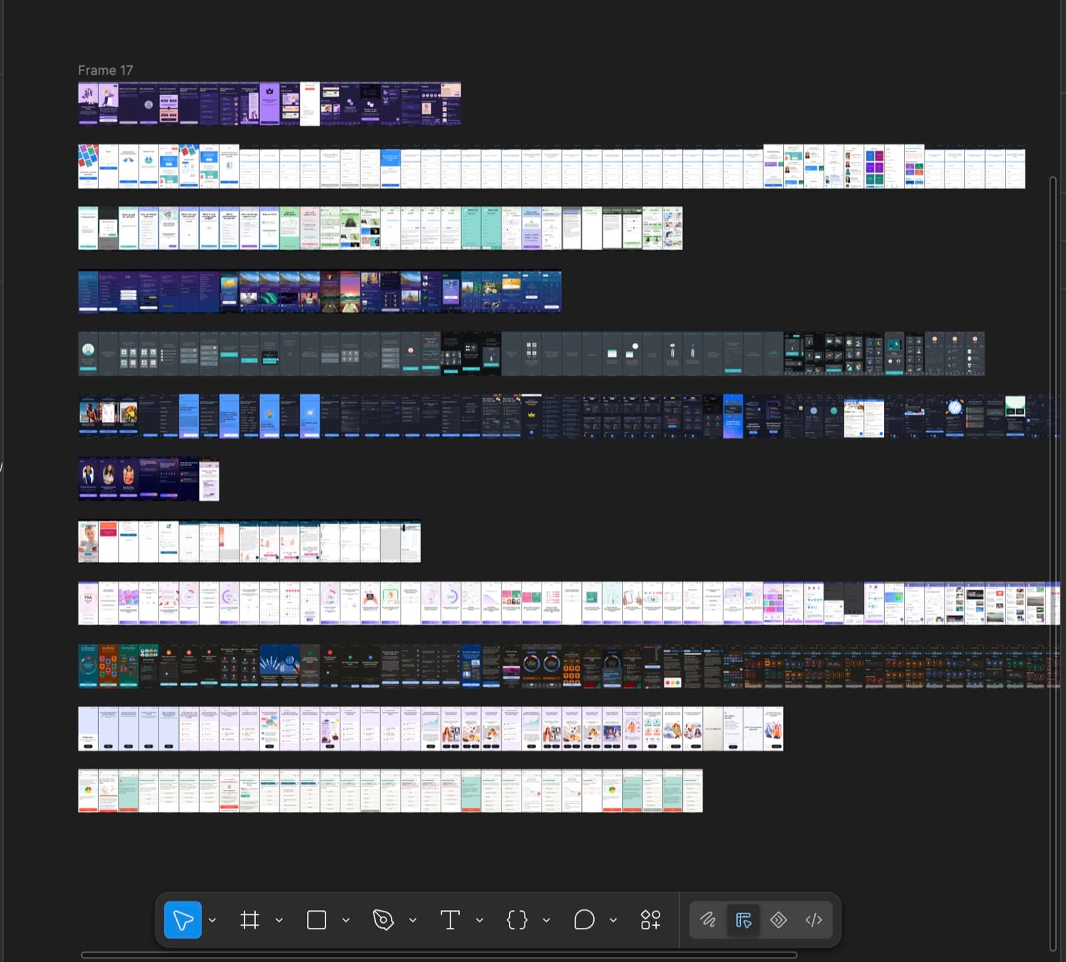
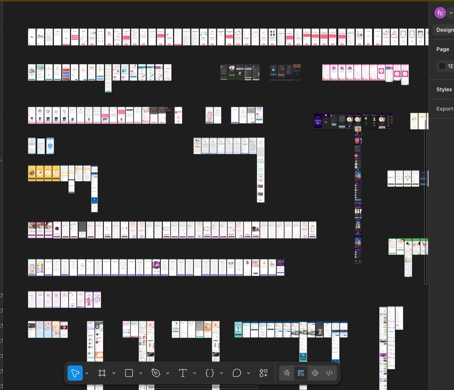
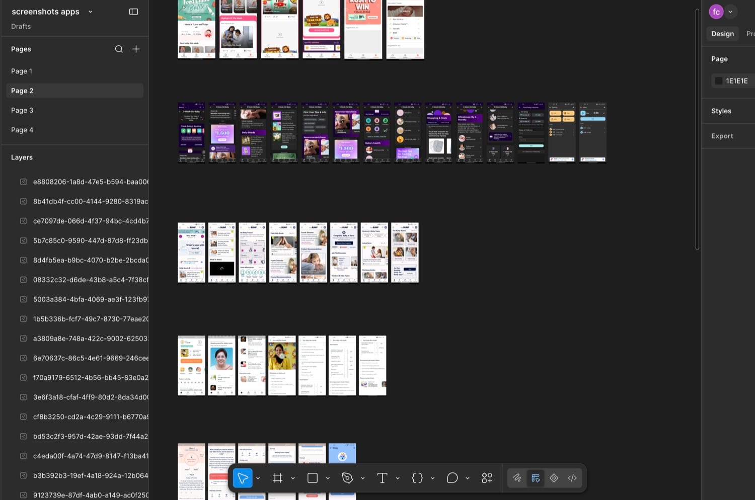
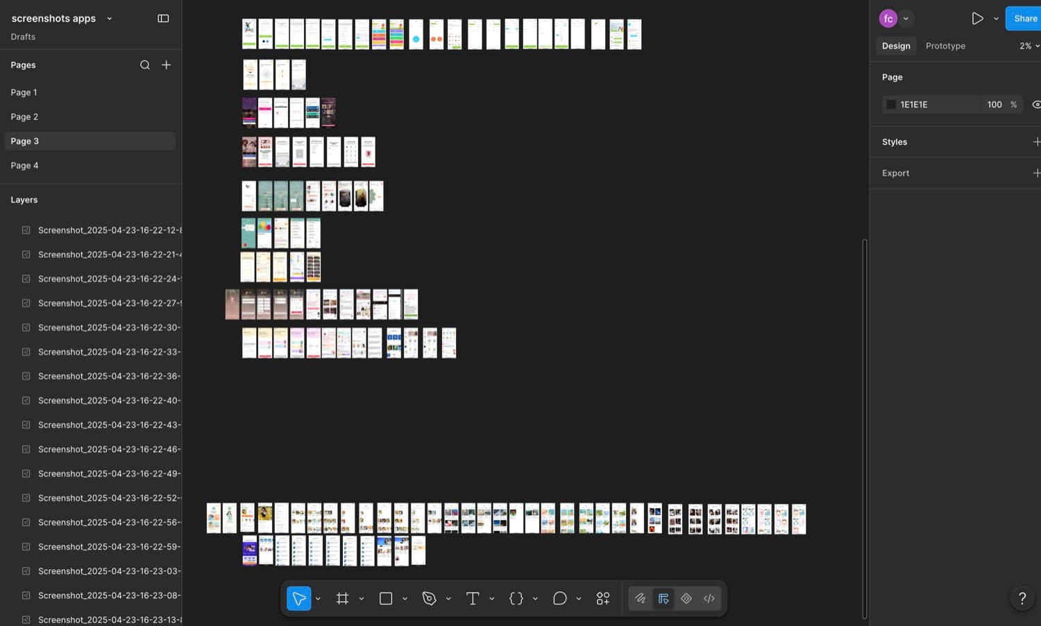
They were strong on content, tracking and community. What none of them did was connect a pregnant woman to her actual care.
| Capability | Maternity apps on the market | Motherhood One |
|---|---|---|
| Week-by-week tracking and development visuals | Yes | Yes |
| Editorial content library | Yes | Yes |
| Community and forums | Yes | Yes |
| Fertility and IVF education | Separate apps | Built in |
| Connected to a real hospital, doctor and bookings | No | Yes |
| Doctor-authored, localized for Indian patients | Rarely | Yes |
| One journey across fertility, pregnancy and baby | No | Yes |
| Daily guidance with reminders and a route back to care | Rarely | Yes |
The market gave women content, tracking and community, but kept it disconnected from their real doctor, generic to their context, and split across life stages. That gap is what Motherhood One was built to close: a hospital-connected, doctor-authored, localized companion that turns guidance into daily action and carries a patient from fertility through pregnancy to early motherhood.
What I learned from interviewing doctors
Interviewing Motherhood's doctors shaped the clinical thinking behind the product. Five themes stood out, each tied to a concrete design response:
Guidance needs to change with pregnancy stage.
In the product Weekly Baby, Body and Checklist content, trimester education and pregnancy-week fitness access.
Nutrition needs health context alongside food preferences.
In the product Condition, complication and allergy intake, with different plan and consultation routes.
Prenatal exercise suitability cannot be assumed.
In the product Consent confirmation, suitability information, discomfort feedback and consultation-linked activity locks.
Self-guided information needs a route back to care.
In the product Booking access alongside doctor notes, nutrition, symptoms and fitness.
Expert advice needs a practical next action.
In the product Meal options, recipes, guided activities, reminders and checklists.
1. Making a large maternity experience relevant to today
The product spanned a lot of ground:
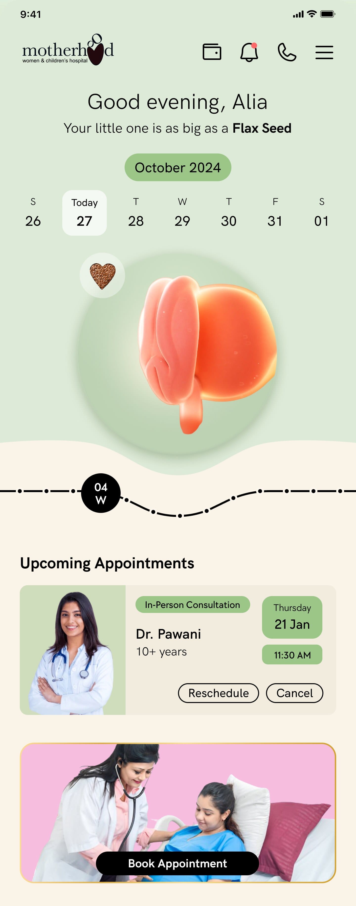
A directory of features alone would leave users to work out what mattered. So the homepage leads with pregnancy context:
1234Weekly guidance is organised into three understandable questions:
- What is happening to my baby?
- What is happening to my body?
- What should I do?
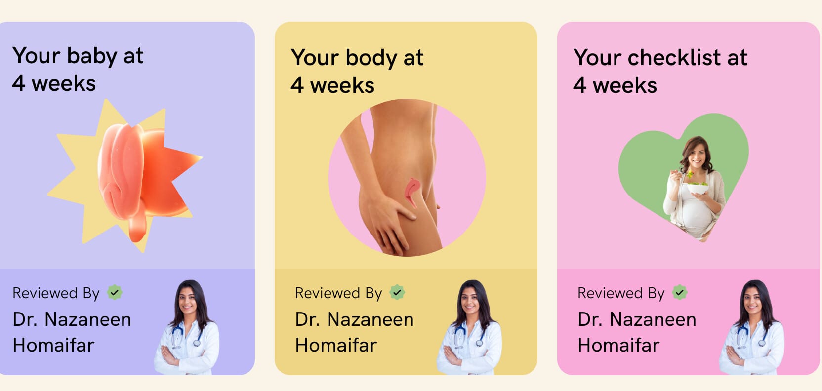
Tap any card and it opens a doctor-reviewed detail for the week: the baby's size, what is developing, and a route straight to a video consultation when a user wants to ask more.
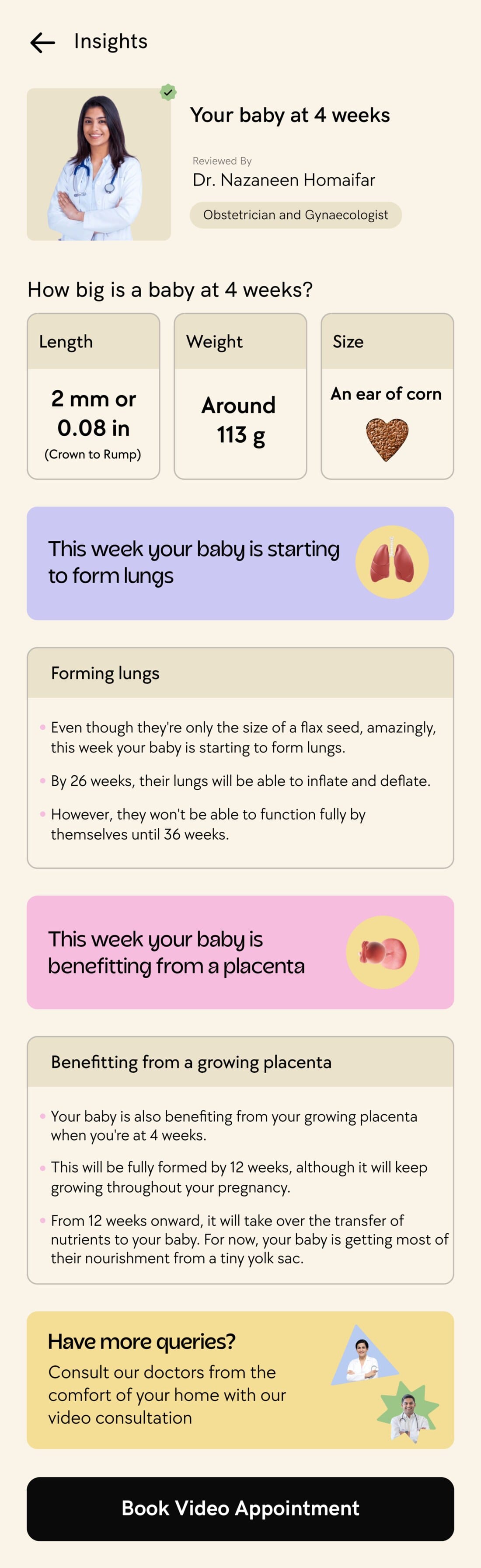
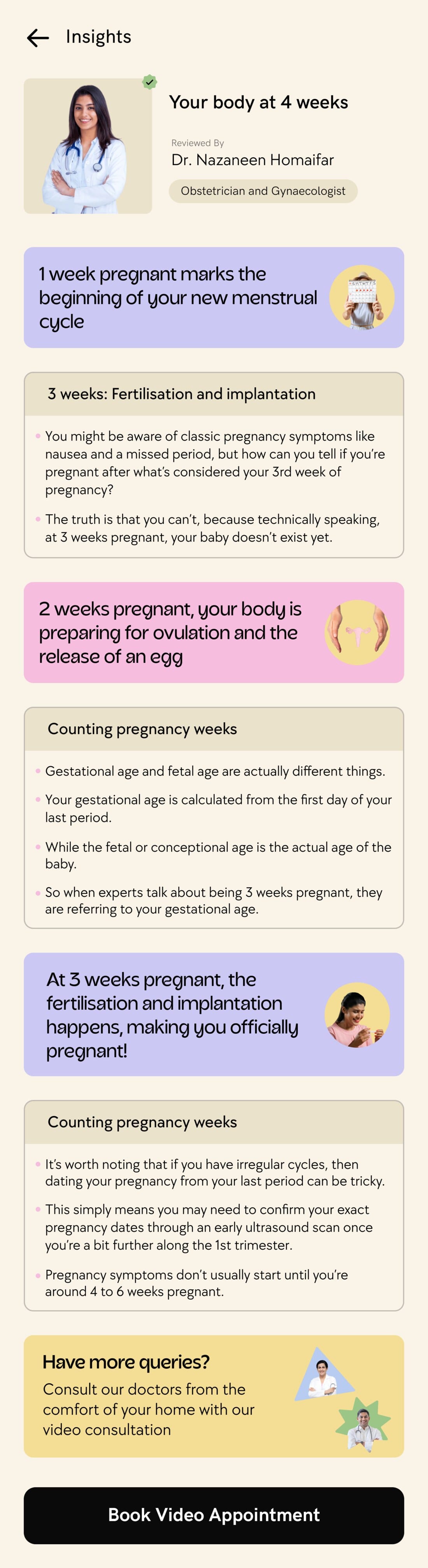
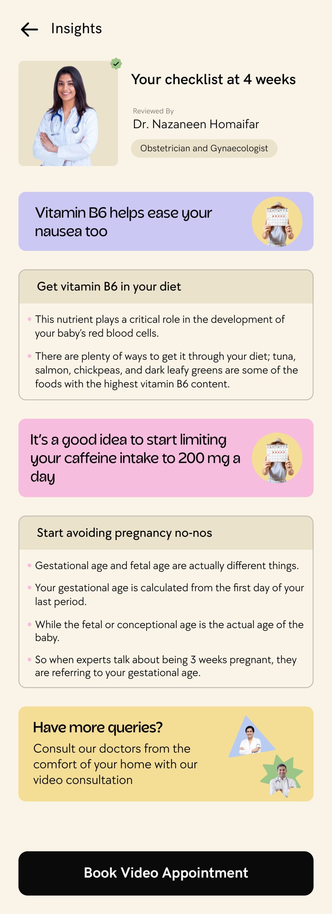
The Baby, Body and Checklist detail screens: doctor-reviewed and stage-specific, each ending in a Book Video Appointment.
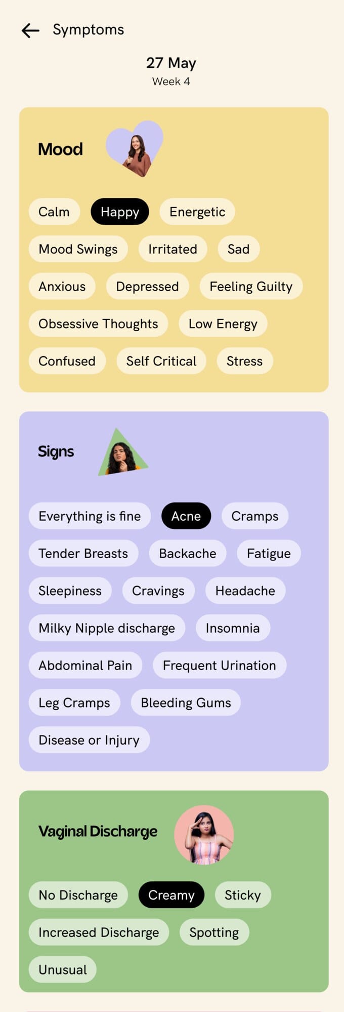
Symptom logging is the other half of the daily loop, and it runs in two directions. A user can record what they are feeling, and anything they log is met with an explanation and, where it helps, a route to a doctor.
Tapping Add opens the full check-in. Symptoms are grouped the way a clinician would ask about them, and a user selects as many or as few as apply before logging the lot against the week.
 123
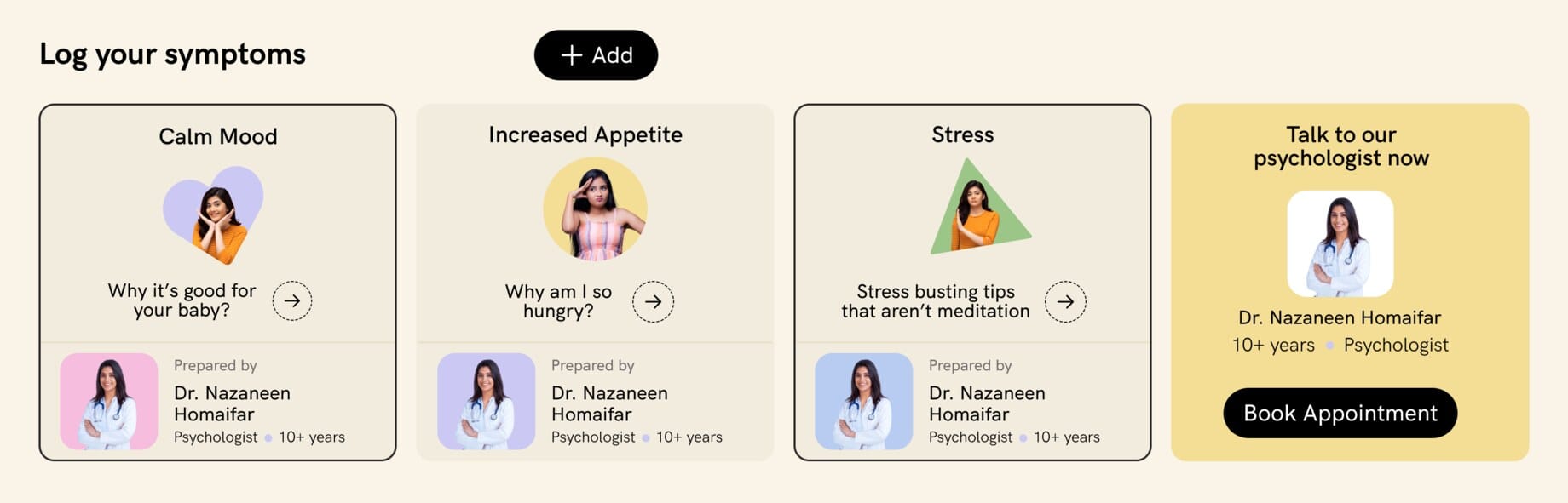
Logging is never a dead end. Tapping a symptom opens a short, doctor-reviewed explainer: whether it is common at this stage, what might be causing it, and when it is worth a conversation.
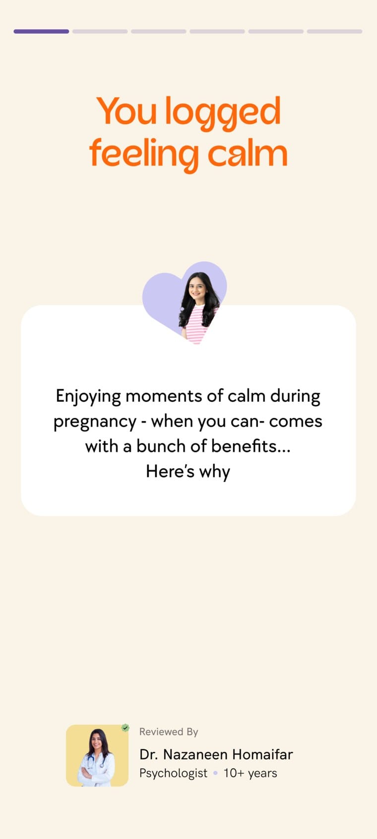
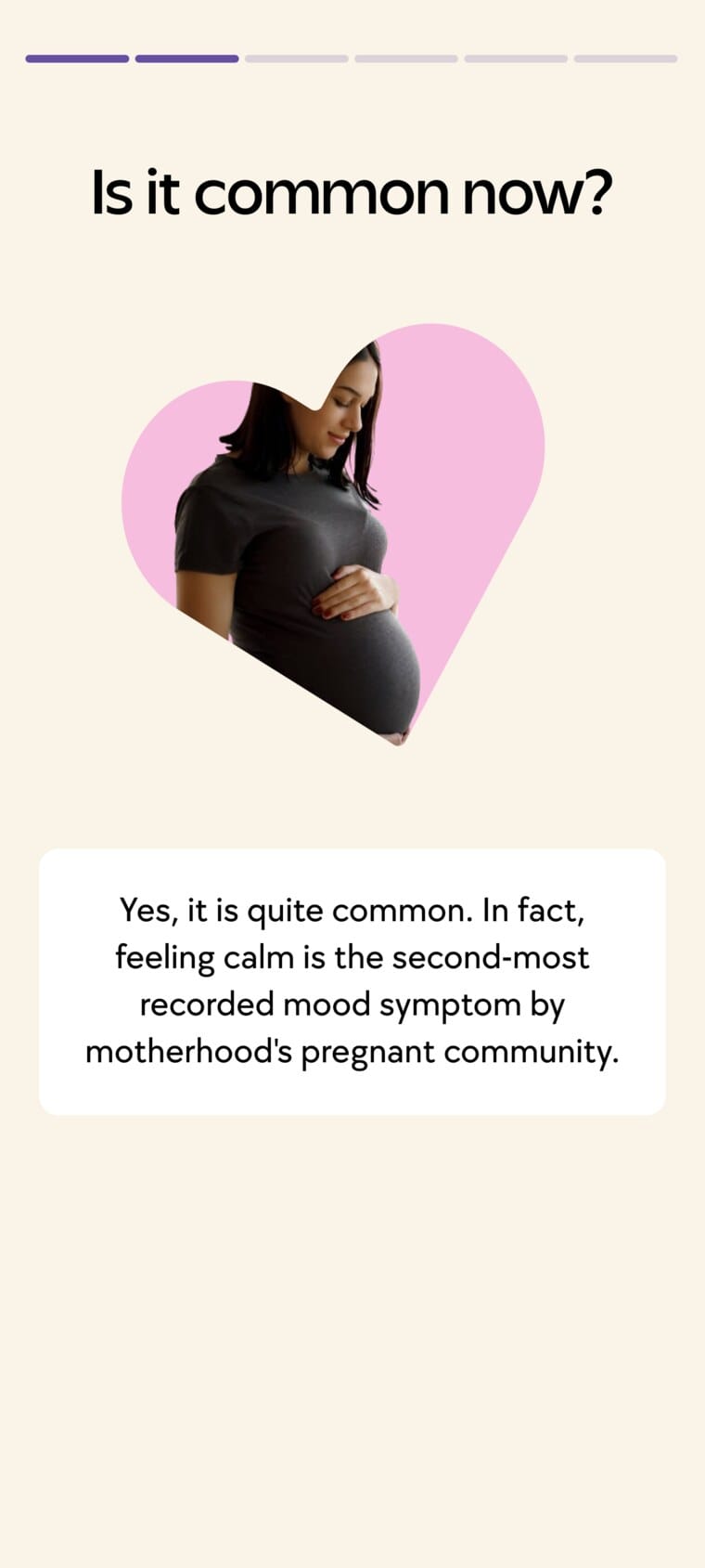
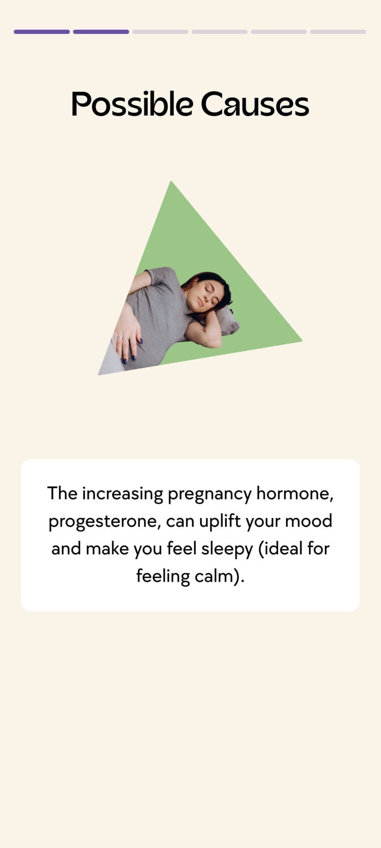
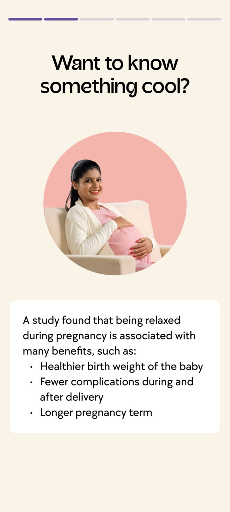
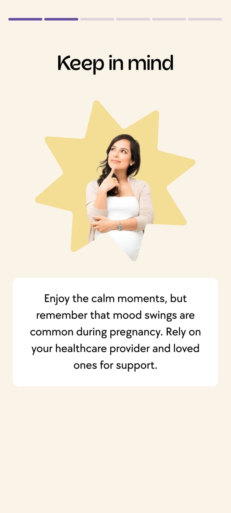

Tapping Calm Mood opens a doctor-reviewed story: it is logged, whether it is common, possible causes, a reassuring study, what to keep in mind, and a way to talk to an expert.
Usage signal: approximately 61% of pregnant users opened the Pregnancy Calendar each month. This indicates recurring use of stage-based content, without establishing that a particular interface decision caused it.
2. Turning expert guidance into everyday action
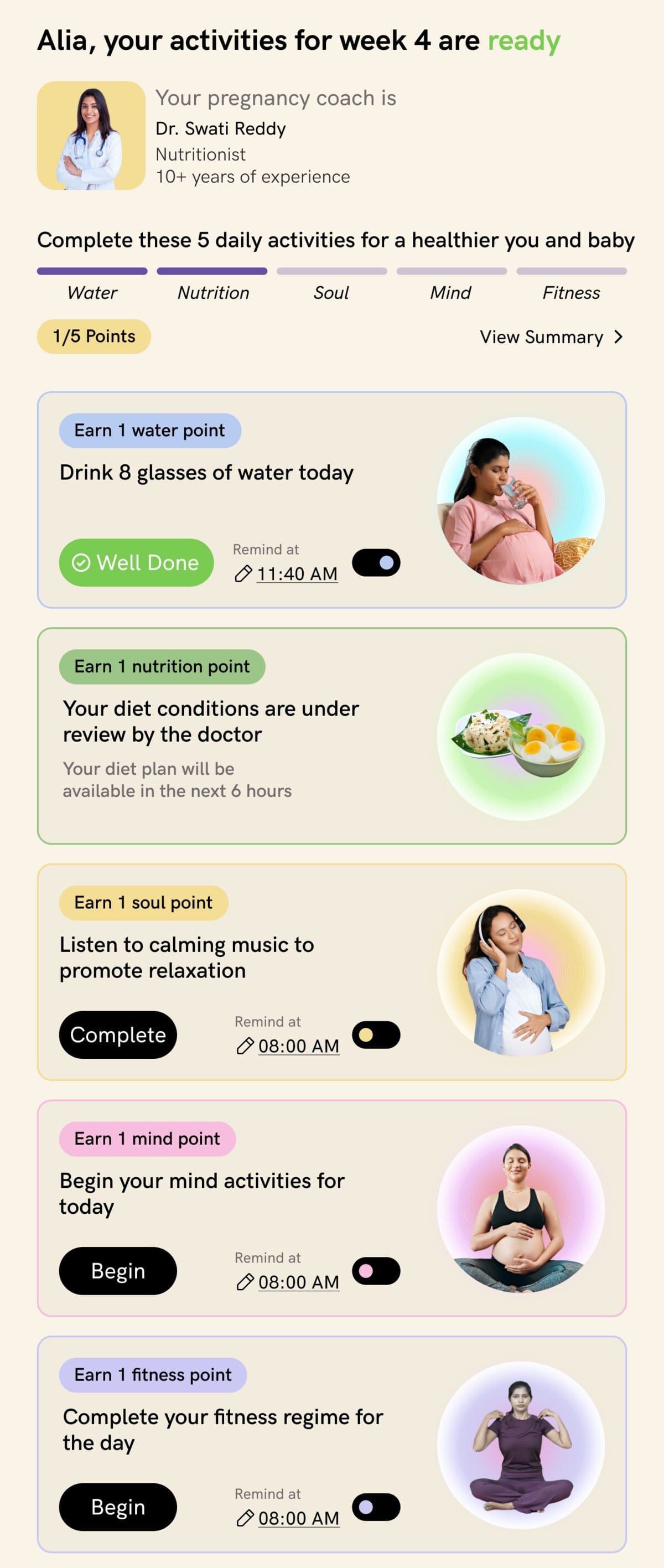
Clinical guidance only helps if people act on it. So instead of publishing advice to read, I reshaped each week's guidance into a small set of daily actions a user can actually finish, grouped into five areas and paced so a day feels doable rather than demanding:
1234Points and reminders turn the plan into a simple loop: finish an action, mark it done, earn its point, and the five together complete the day. Reminders are optional and set per activity, so it nudges without nagging.
Each activity was prepared with doctors, and some leave room to choose. Within Mind, a user picks from options such as guided meditation or affirmations rather than following one fixed task.
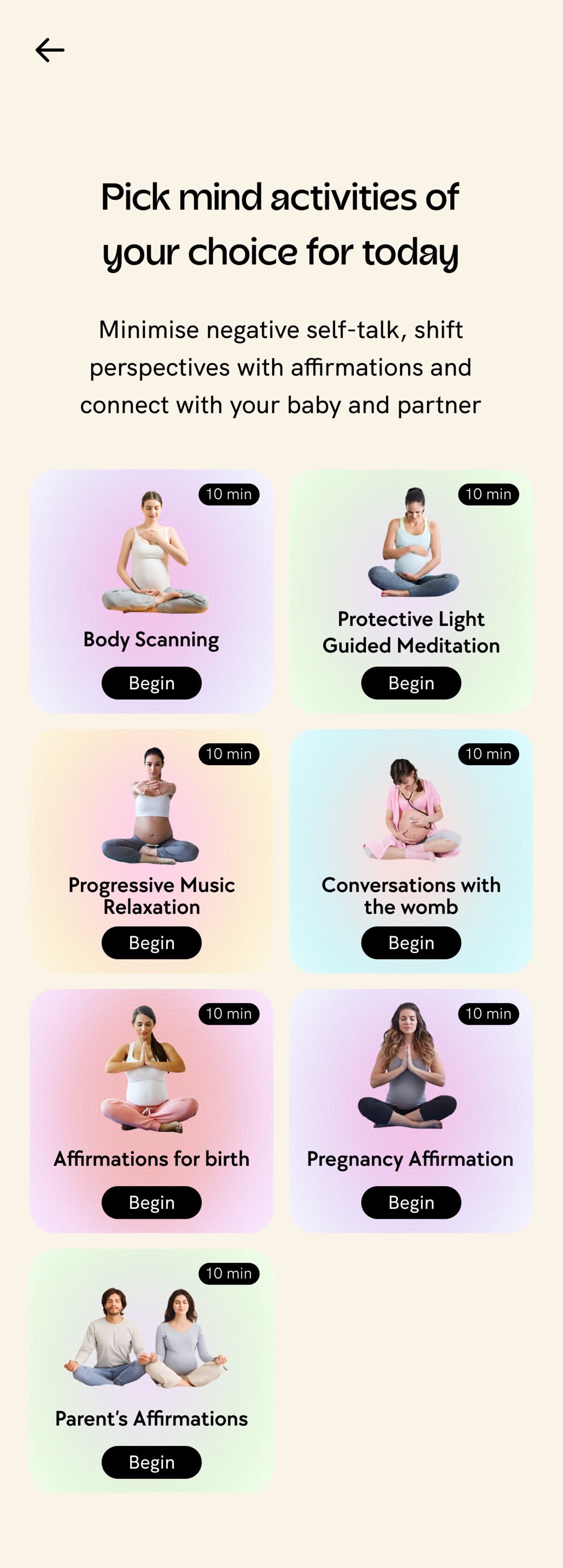
Explanations and video guidance help users understand an activity before completing it, and rewards recognise participation without implying a measured health benefit.
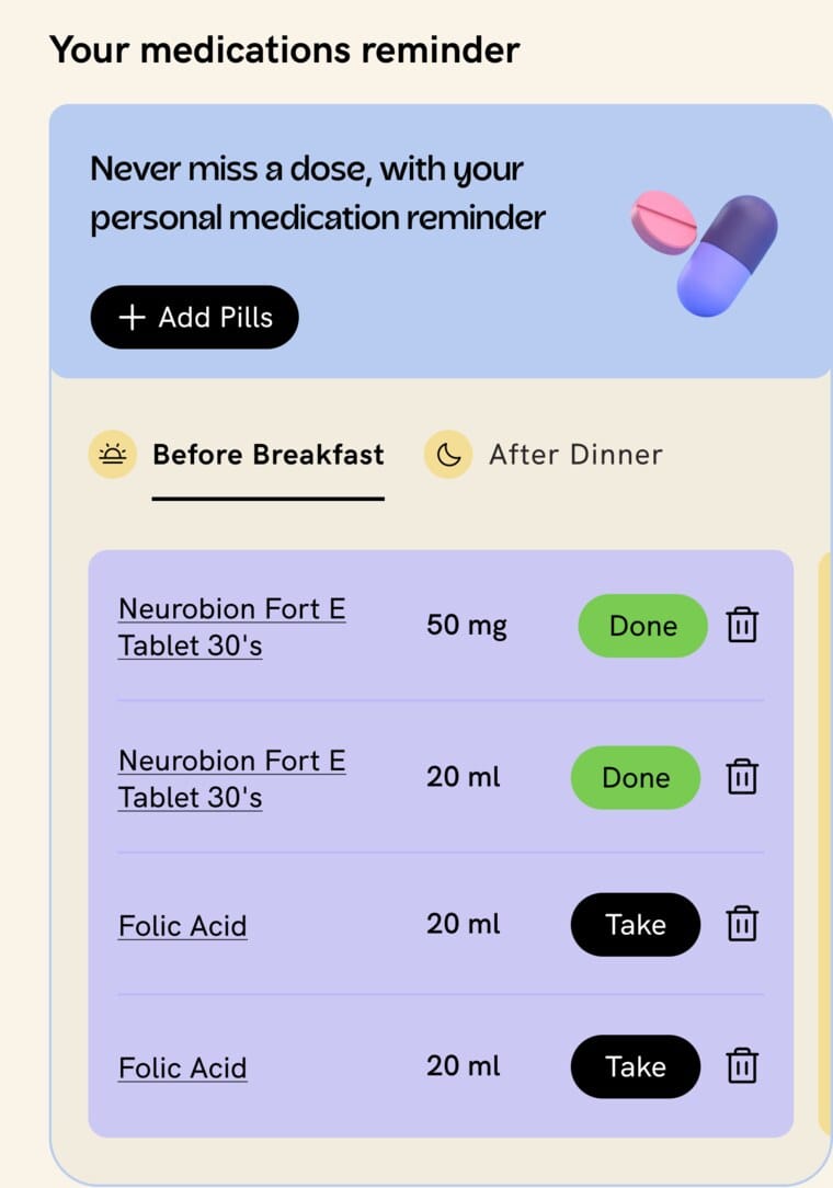
Medication reminders connect instructions to routine. Users configure the details and see scheduled medicines on the homepage with Take and Done states.
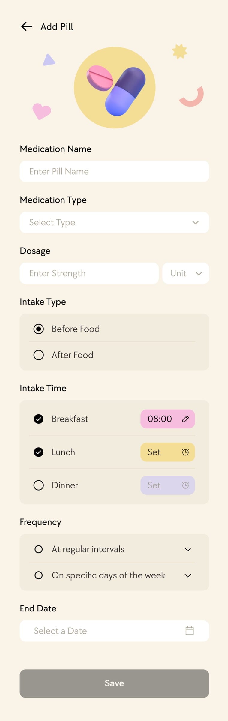
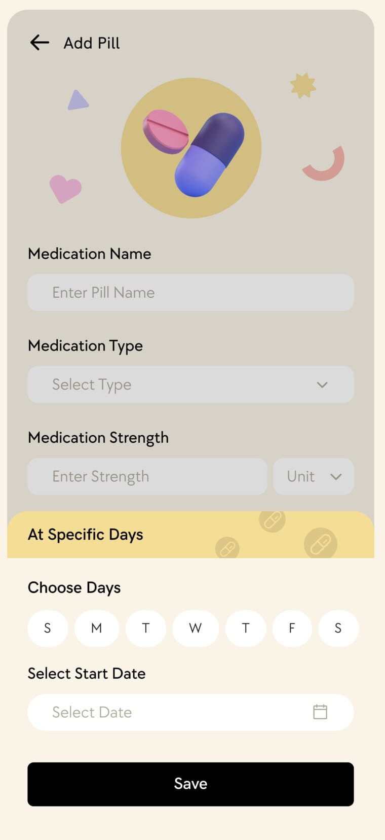
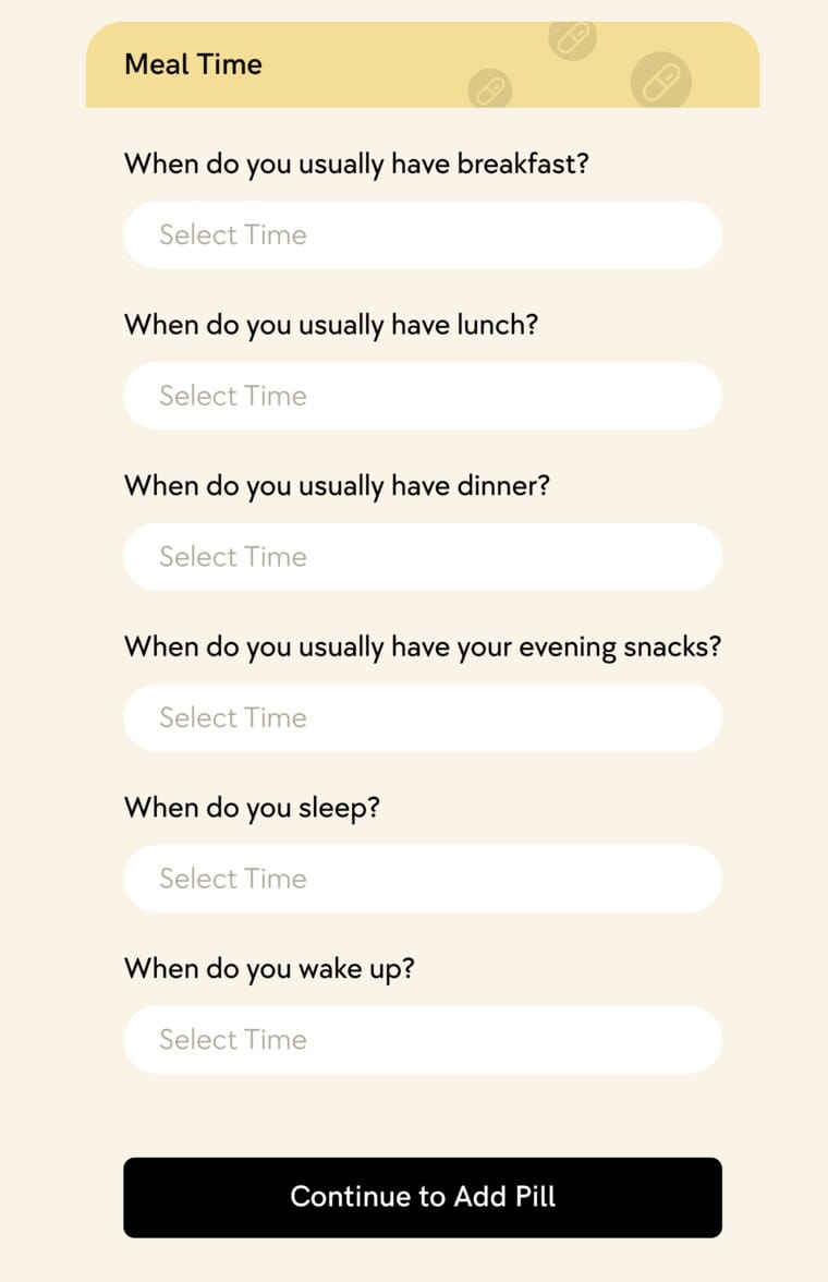
Adding a medicine is its own small check-in: name, type and dose, and whether it is before or after food; the exact days it repeats; and the user's own meal and sleep times, so a dose lands at a moment that already exists in their day.
Once a medicine is added, its scheduled doses surface on the homepage:
 1234
Nutrition: personalised guidance with clinical boundaries
Doctors manually supplied dietary items for different patient types, organised across pregnancy stages and condition-specific groups. The intake collects health context alongside practical preferences:
Different answers lead to different routes:
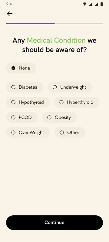
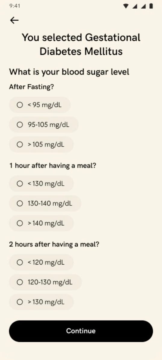
The nutrition intake collects health context alongside preferences, and different answers route to different plans or a nutritionist consultation.
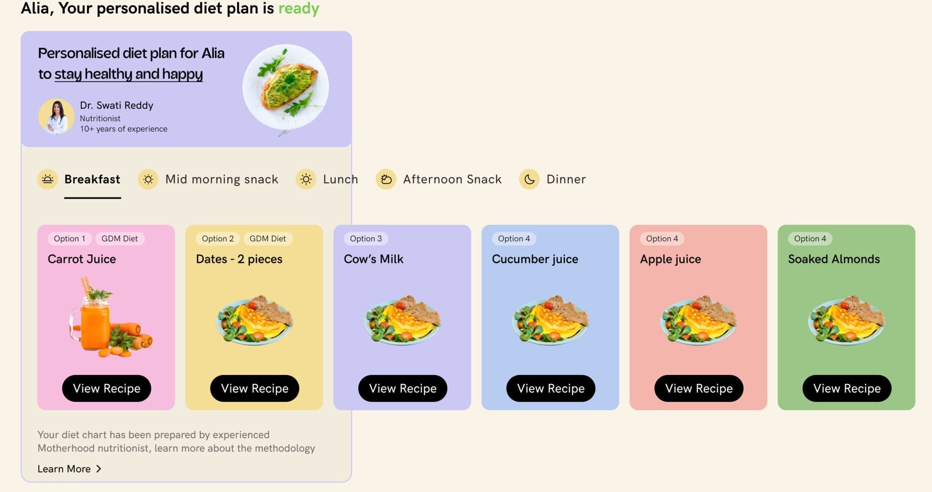
Tapping View Recipe does not jump straight to the dish. A suitability check comes first, then the recipe itself.
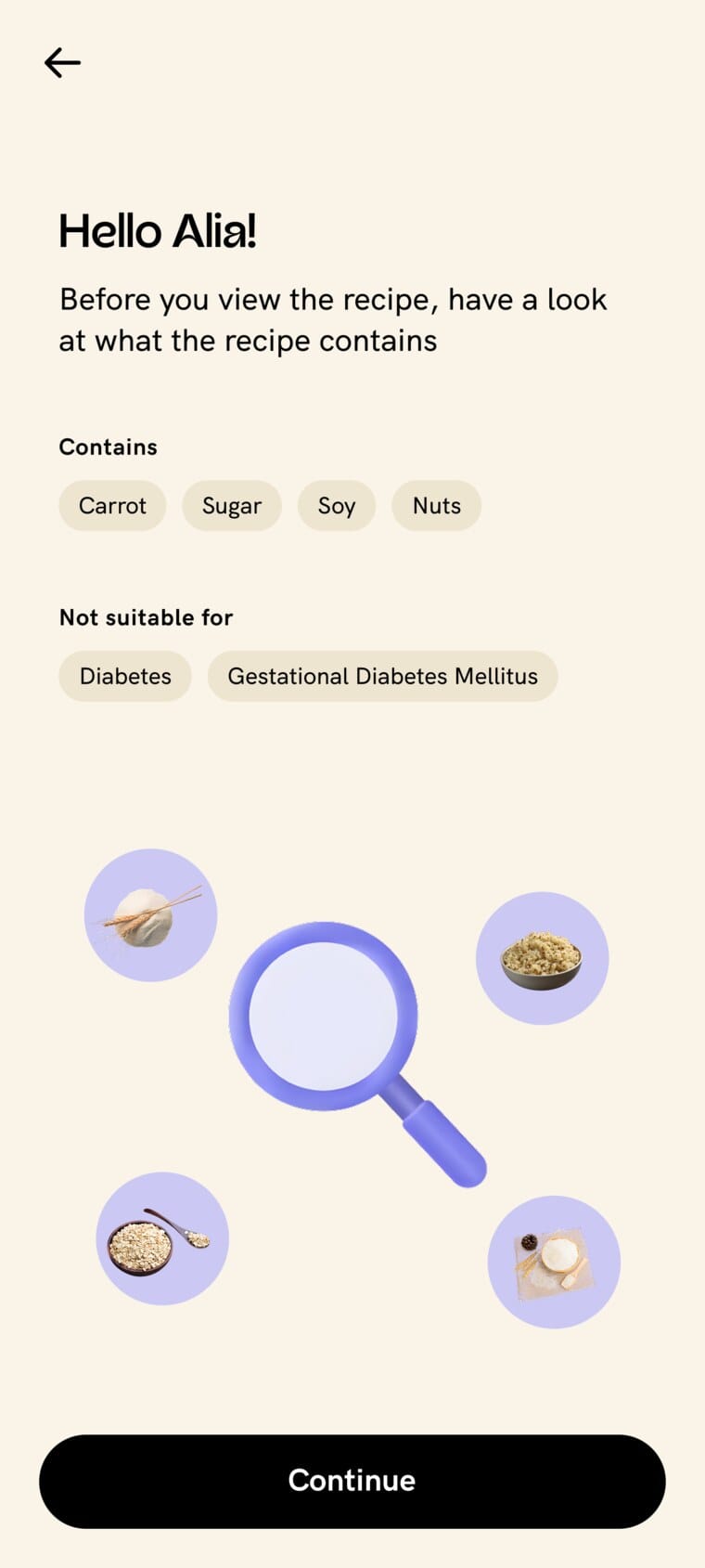
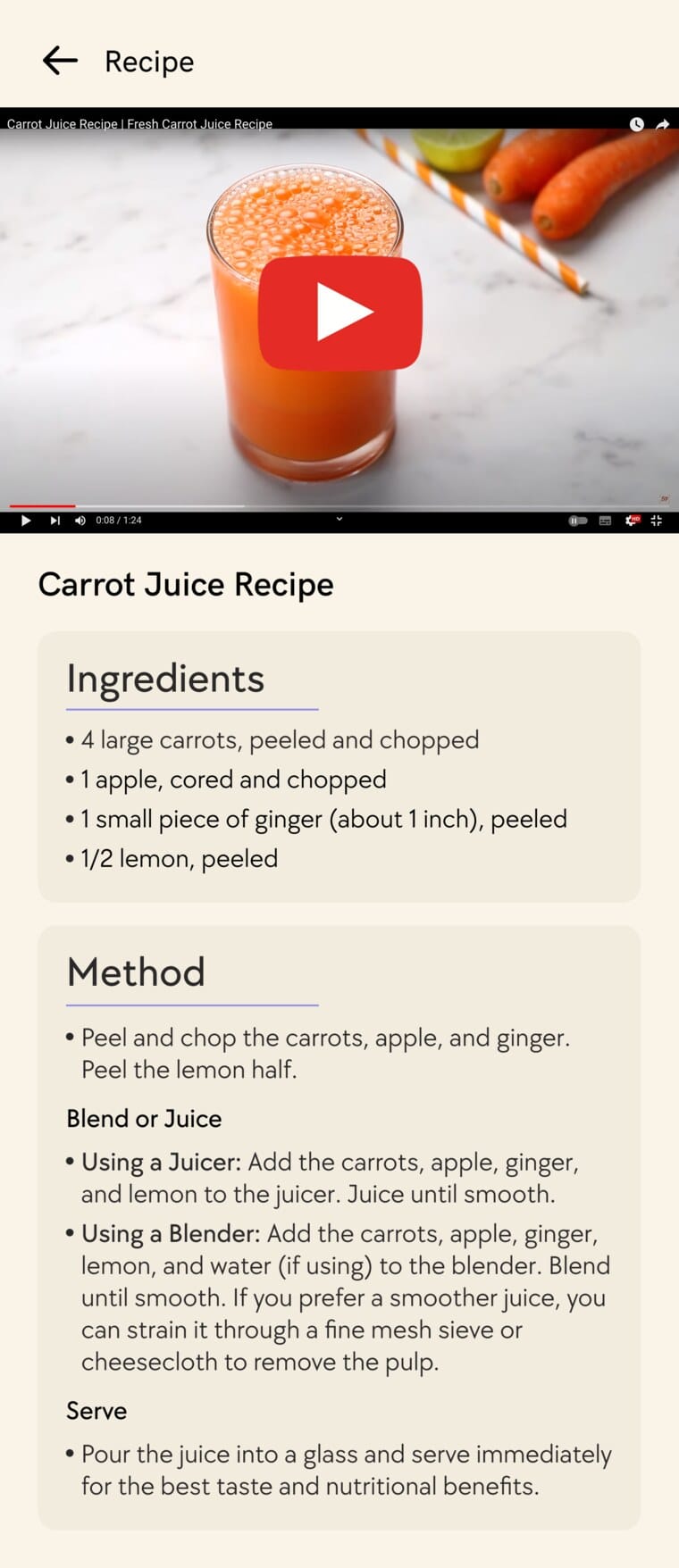
Before the recipe, a plain-language check: what it contains, and who it is not suitable for (here, diabetes and gestational diabetes). Then the recipe arrives with a video, ingredients and method.
3. Building pregnancy fitness around safety, not just completion
Fitness meant both creating original content and designing how users would reach it. The team produced Motherhood's own videos with two yoga-certified doctors, placed within a pregnancy-stage programme rather than an undifferentiated exercise library.
The flow puts safety before the video, and keeps a route back to care after it:
In the product, the heart of that flow is three screens: the exercise introduced on its own, the guided video, and a feedback check straight afterwards.
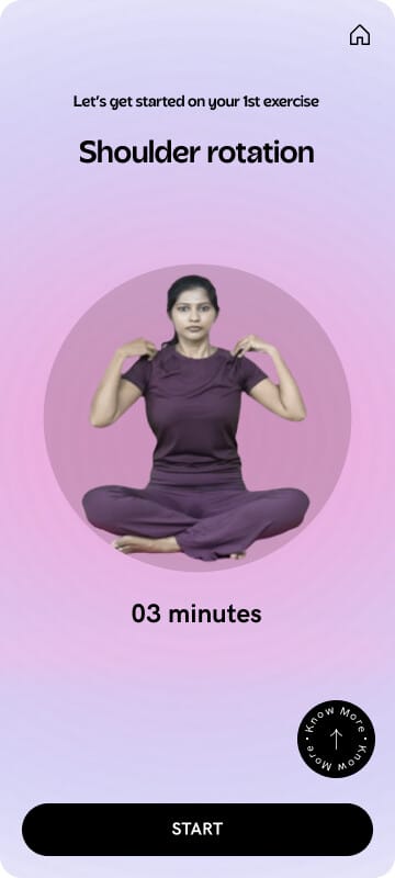
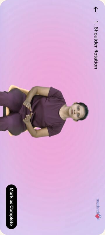
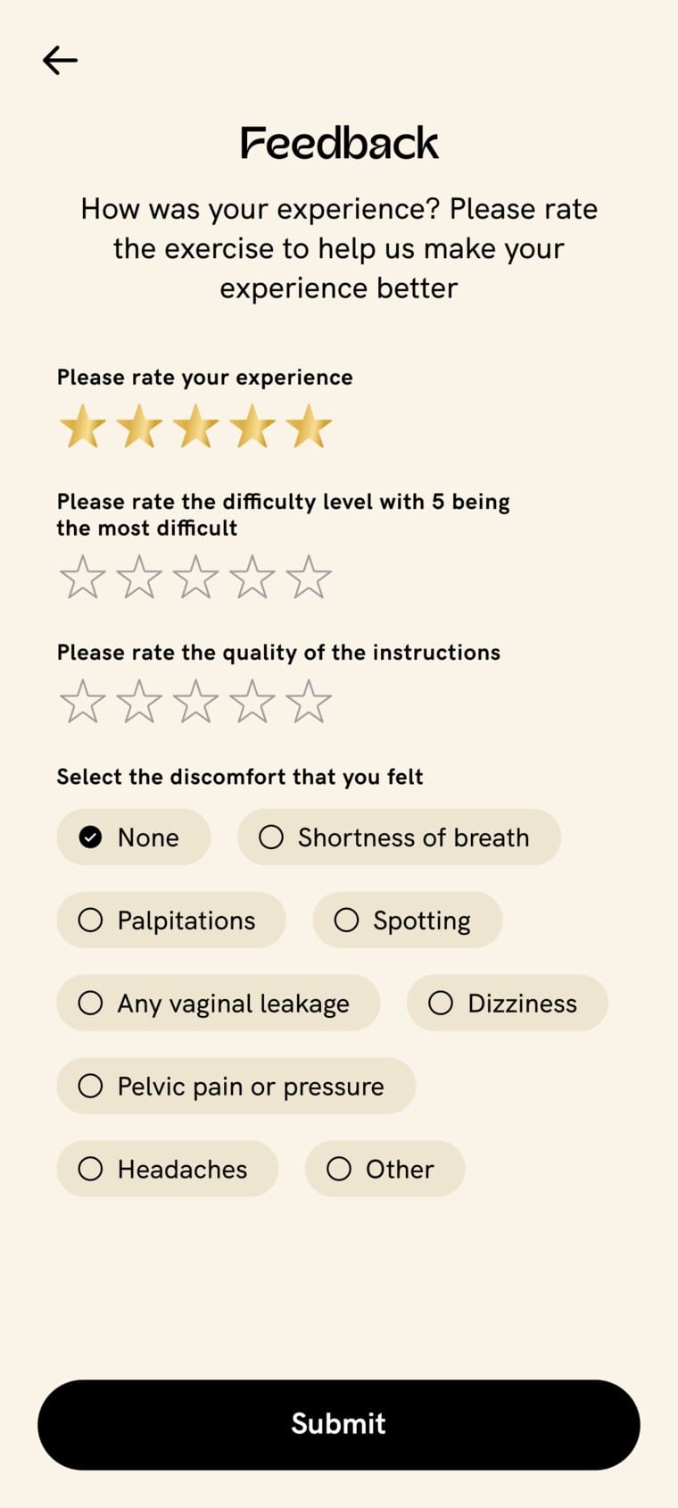
Left to right: each exercise opens on its own with a name, a length and a START; the guided video, recorded with Motherhood's yoga-certified doctors, ending in Mark as Complete; and a post-exercise check that rates difficulty and instructions and flags any discomfort, which can route a user back to care.
The design makes an important boundary visible: activity completion does not override the need for clinical attention.
That connection (from guidance to activity, feedback and care) is the strongest example of how clinical considerations shaped the consumer experience.
4. Making the subscription tangible
Users without a subscription still meet pregnancy context and hospital-booking entries. Rather than relying only on a separate sales page, paid experiences are previewed exactly where users would use them:
The subscription introduction and detail screens then explain the wider offer through benefit summaries, expert-video previews, pricing and FAQs. Account screens cover status, renewal, payment methods and cancellation, with access continuing until the displayed end date.
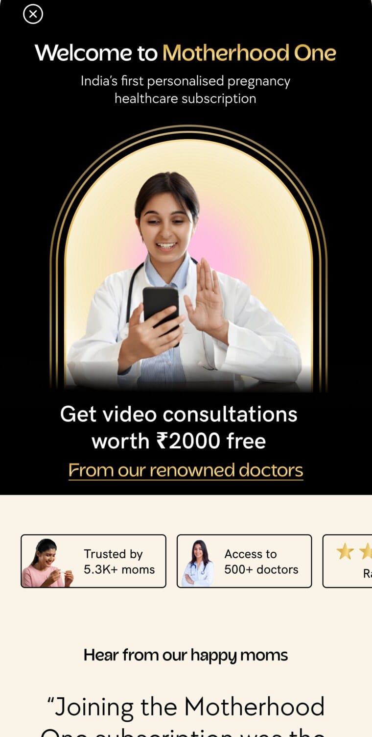
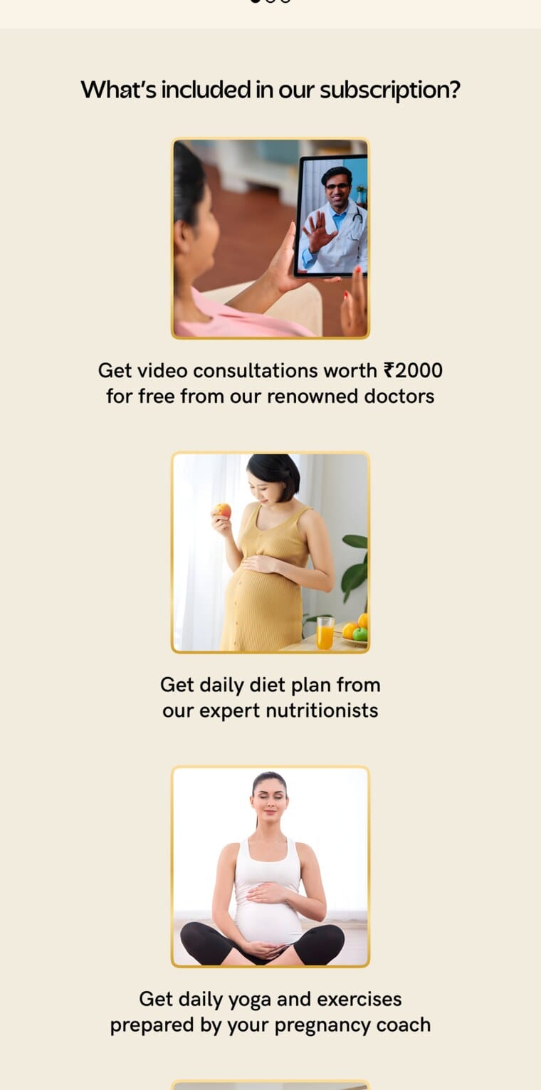
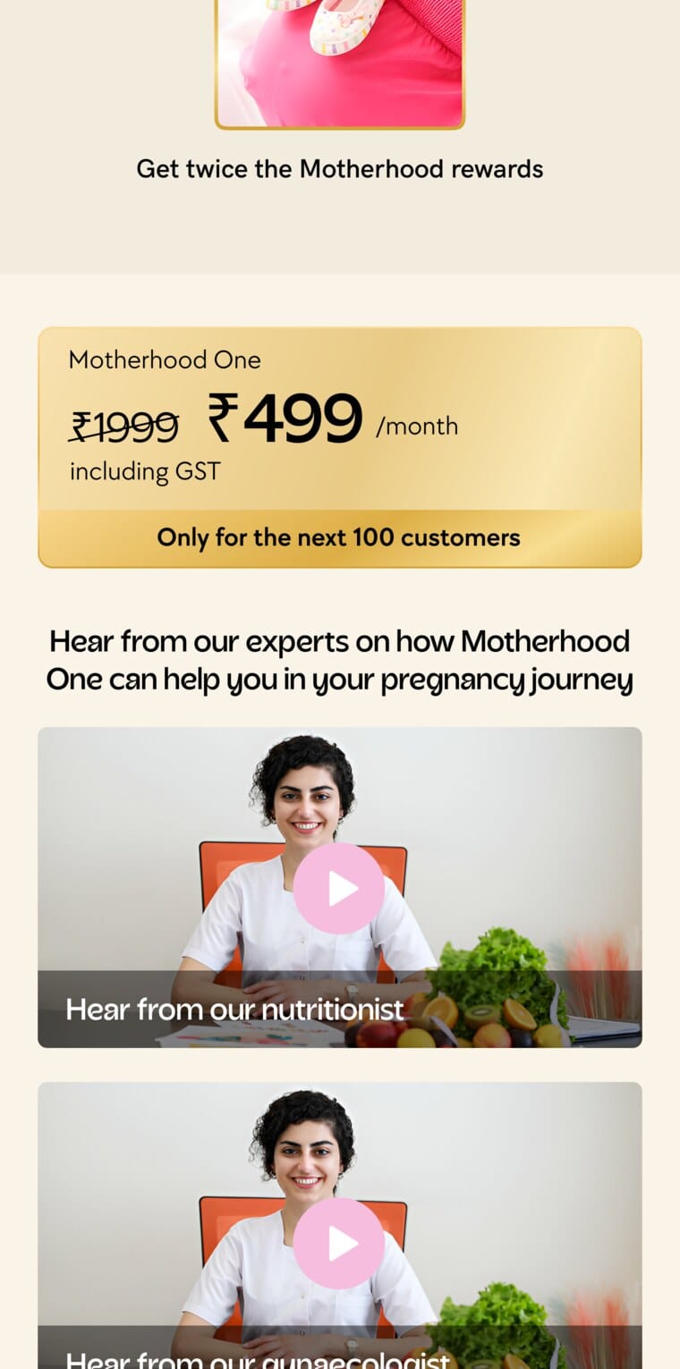
The Motherhood One sales page, in three beats: the free-consultation hook with trust badges; what the subscription includes (consults, diet, yoga and more); and the pricing, with member testimonials and expert videos as social proof.
Together these show attention to the whole membership lifecycle, not only acquisition. The supplied screens do not establish checkout behaviour or conversion improvements.
5. A secondary feature became a meaningful lesson
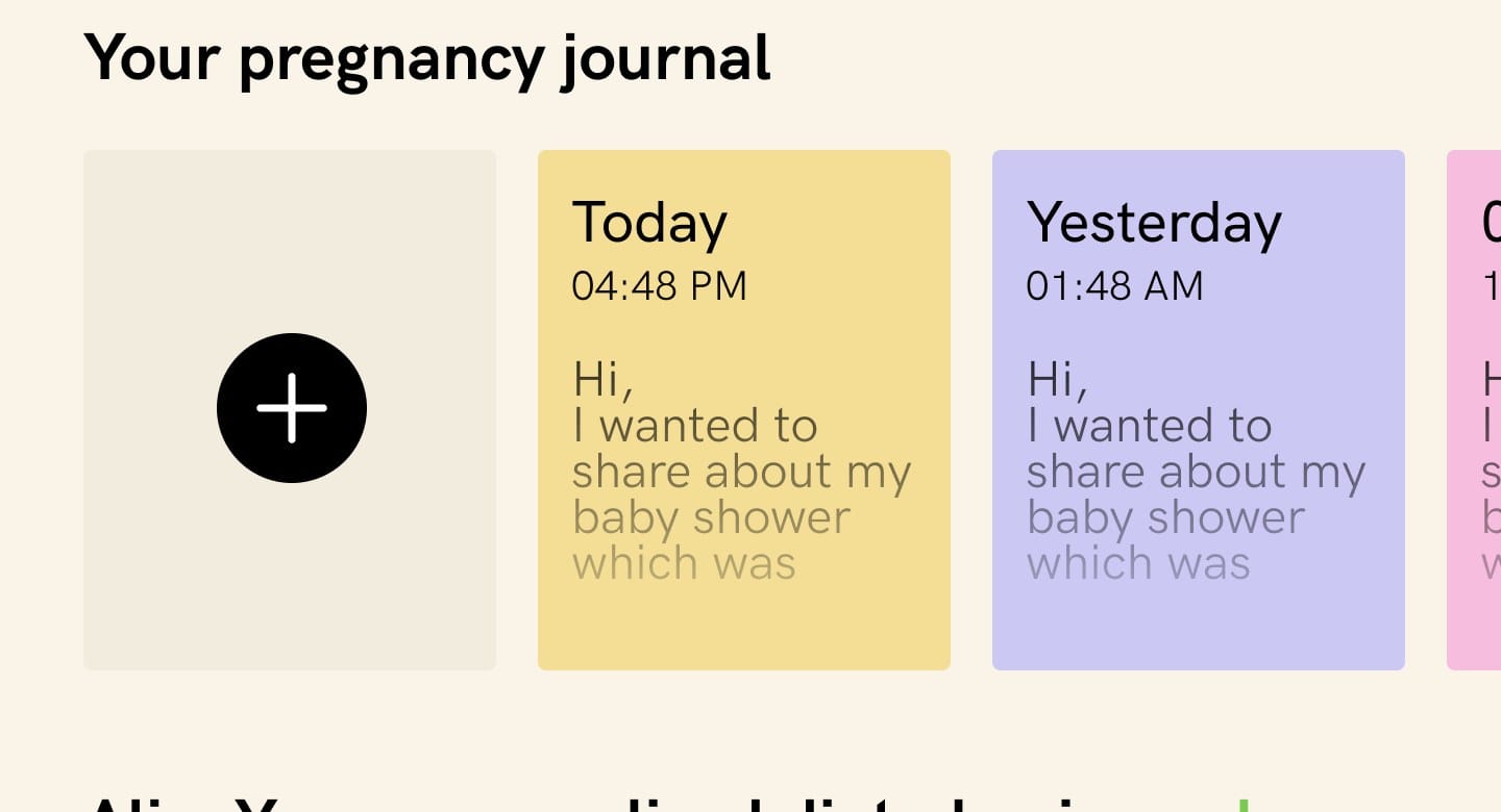
I included the Pregnancy Journal as a secondary feature, without expecting it to become a major reason to use the app. The journal offered entries, reminders and a passcode option.
The CXO I worked with later shared that some women were using it to write openly about difficult experiences at home. Its role as a space for emotional expression became more meaningful in retrospect. This was an observation relayed by the CXO, not a user interview or evidence of a clinical mental-health outcome.
It reminded me that users can find value beyond the purpose a designer initially imagines. A feature for documenting pregnancy could also become a place to express what pregnancy felt like.
6. Kick Counter: a simple interaction with complete supporting states
The Kick Counter centres on tapping an illustration of baby feet when the baby kicks. A count and timer show the active session, with Reset and Finish once it is underway. Completed sessions record start time, end time, duration and kicks; today's entries stay below the counter and View All opens date-grouped history.
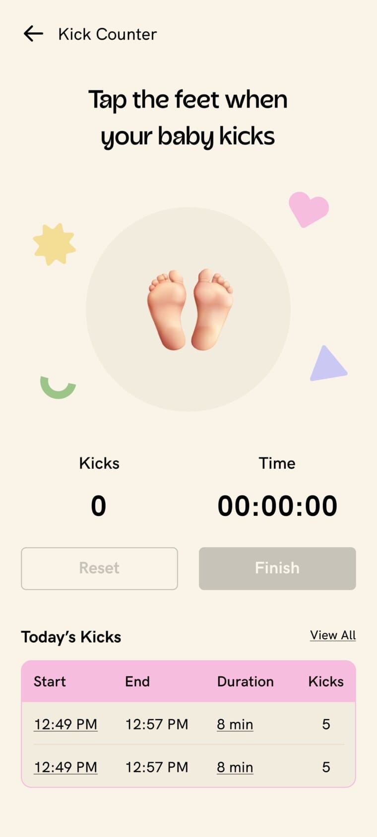
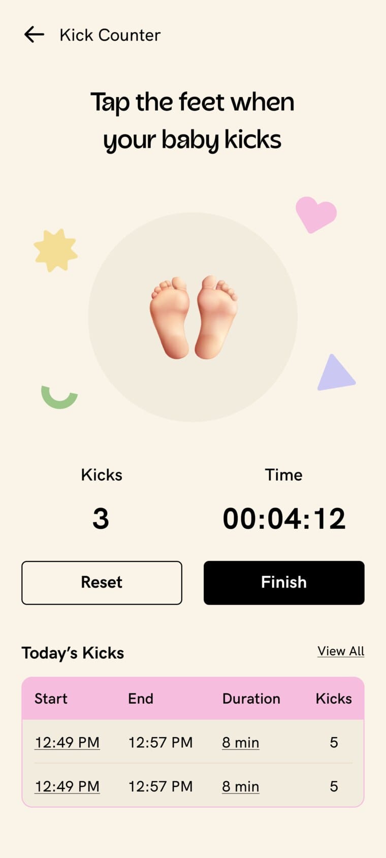
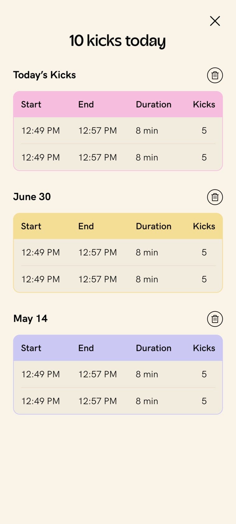
Three states of one small interaction: the resting counter with its controls disabled; a live session counting kicks against a timer, Reset and Finish now active; and the full history, grouped by date, that View All opens.
Supporting dialogs make record changes explicit:
- Editing a start time.
- Resetting a session.
- Deleting entries.
The feature is a recording tool, not an automated diagnosis or evidence of improved clinical monitoring.
7. Information, live expertise and everyday discovery
Beyond the daily plan, three surfaces let users explore on their own terms:
These add discovery and registration or join entry points into expertise, not verified attendance outcomes.
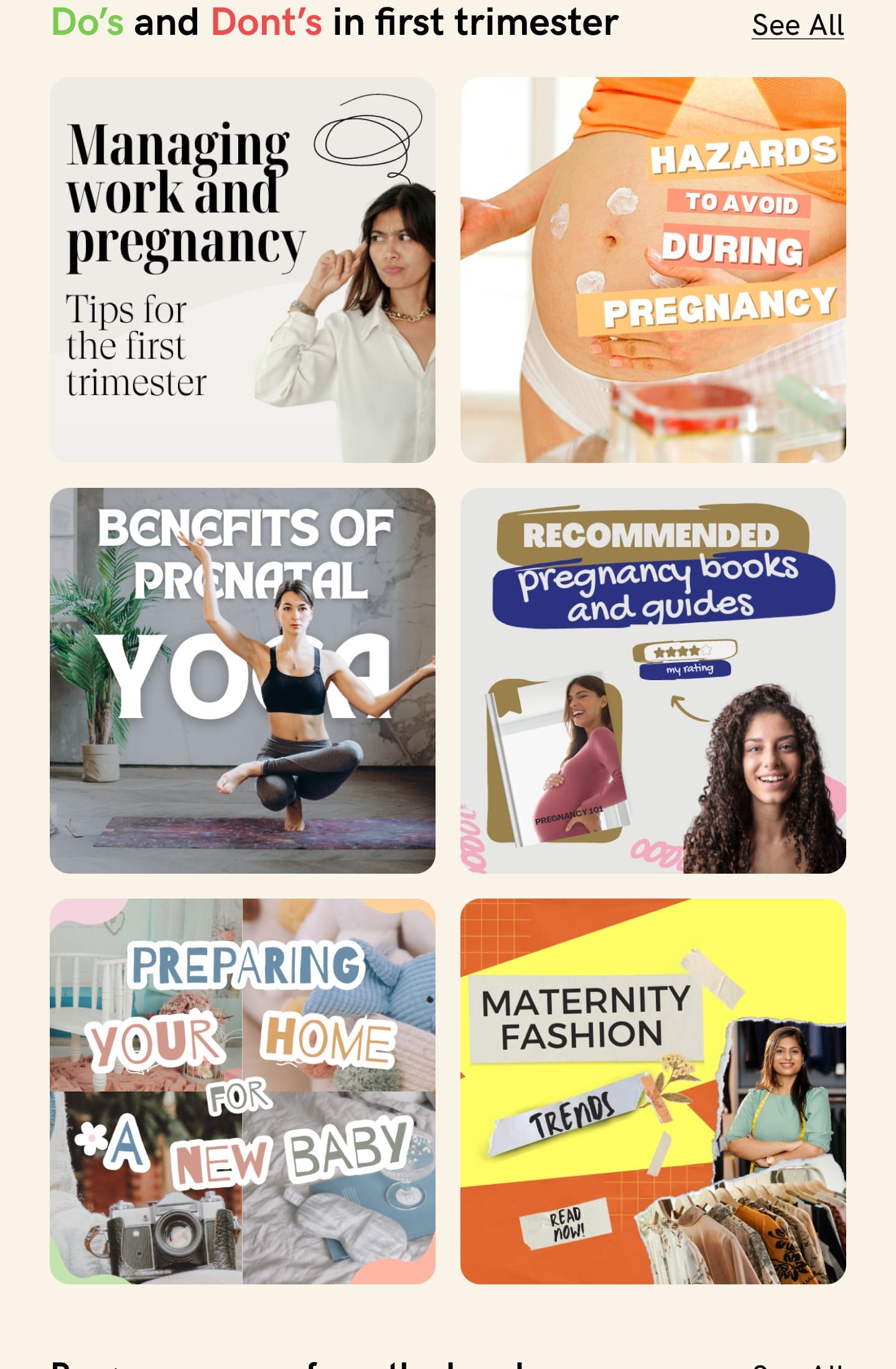
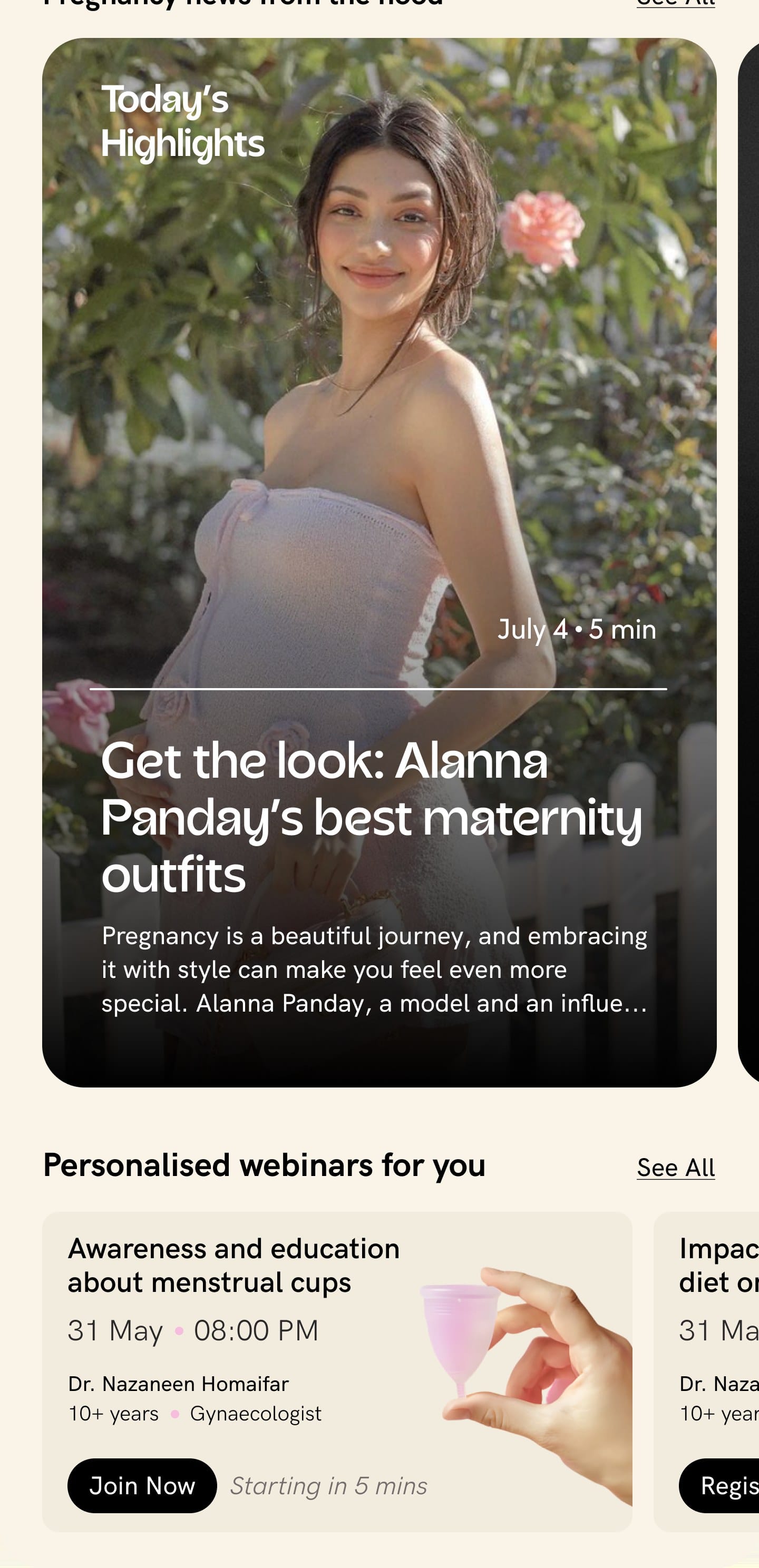
Two more surfaces for self-directed discovery: the Health library as trimester do's and dont's (managing work, hazards to avoid, prenatal yoga, books, preparing the home, maternity fashion), and Pregnancy news as a featured highlight alongside expert webinars with Join or Register actions.
8. Community: designing participation, not only a feed
The Community designs cover the whole participation journey. Month-based groups sit alongside topic spaces:
Before joining, group rules set expectations around kindness, judgement, promotion, spam and sensitive content, so expectations are visible before entry rather than left implicit. Participation flows cover:
- Text and image posts, with attachments added or removed.
- Comments and nested replies.
- Likes, sharing and deletion with confirmation.
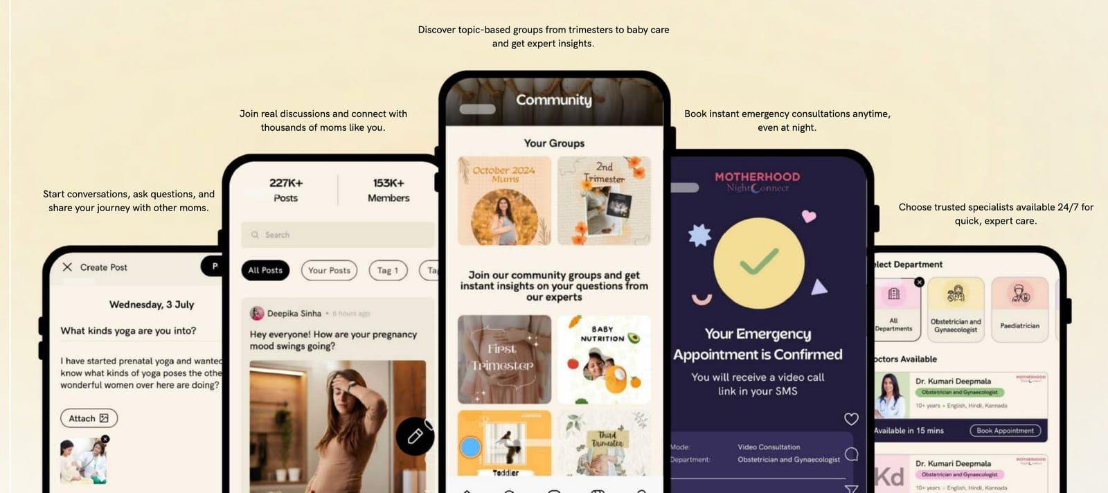
Community is included as designed scope; launch status and moderation effectiveness need separate confirmation.
9. Profile: managing a broader relationship with Motherhood
Profile manages a broader relationship with Motherhood than the daily dashboard. It centres on life-stage selection:
The account experience brings the rest together:
- User switching, Add User and profile-completion progress.
- Quick access to Kick Counter and Pregnancy Journal.
- Bookings, life-stage settings and subscription management.
- Help, settings and logout.
The designs acknowledge the account extends beyond a single pregnancy screen. They do not, by themselves, establish family permissions or automatic transitions between life stages.
Subscription introduction and the unsubscribed homepage
The unsubscribed homepage keeps pregnancy-week context, the development visual, calendar and hospital-booking entries, with contextual previews explaining doctor notes, fitness, nutrition, symptom guidance and locked library content where users would meet them.
A segmented promotional introduction presents Motherhood One through nutrition, coaching, doctor notes, symptoms, tools, consultations, meditation and rewards, each screen keeping a Get Motherhood One action. The longer page adds clinician imagery, expert-video previews, pricing, testimonials and FAQs; active-membership screens handle renewal, payment visibility and cancellation.
These marketing elements explain the offer; their sample claims are not project outcome metrics.
10. Later evolution: Motherhood Champions Academy
Courses arrived much later, expanding Maternity from daily guidance into structured learning about pregnancy and preparing for labour.
Introducing learning and recognising progress
The homepage introduces the Academy with course cards and a learning dashboard: stage completed, badge earned, courses completed and a progress bar with milestones like Rising Mom and Power Mom.
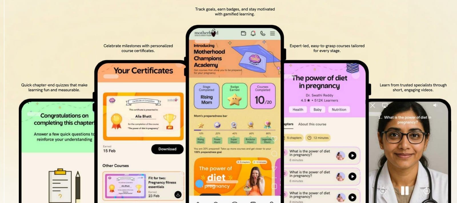
The preparedness percentages are product milestones, not clinically validated measures of readiness.
From discovery to chapter completion
Course detail screens combine expert attribution, topic tags, an About This Course explanation and a chapter list. Chapters carry distinct states so a returning user can spot unfinished work:
Quizzes, feedback and the next step
Each chapter runs the same loop, from watching through to a certificate:
The experience connects watching, answering, feedback and progression rather than treating videos as the whole course. Placeholder quiz questions in the mockups are not evidence of validated assessment or measured learning.
Certificates and returning to completed courses
Completed courses show checked chapters with replay access and View Certificate. The collection provides downloads and earned dates across subjects including fitness, labour preparation and hydration, giving achievement a persistent place beyond a one-time congratulations screen.
The reported discovery signal was that 35.8% of new users reached the course library. It belongs to this later phase and measures discovery, not completion, understanding or clinical readiness.
The delivery work behind the experience
The vertical depended on a substantial body of content, and the screens were only one part of making it real:
I spent significant time in Strapi uploading and organising app data and images, connecting the designed journeys with the content they needed to function. Clinical collaboration, doctors testing prototypes, original video production and content implementation were all part of the work.
It strengthened my understanding of product ownership beyond the prototype: a content-heavy healthcare experience needs attention to both its interactions and the material behind them.
Beyond Maternity
After Maternity's successful run, I extended the same product into two further stages of the patient journey, carrying the pregnancy-experience approach into a newborn's early months and into the demands of a treatment cycle.
Mom & Baby
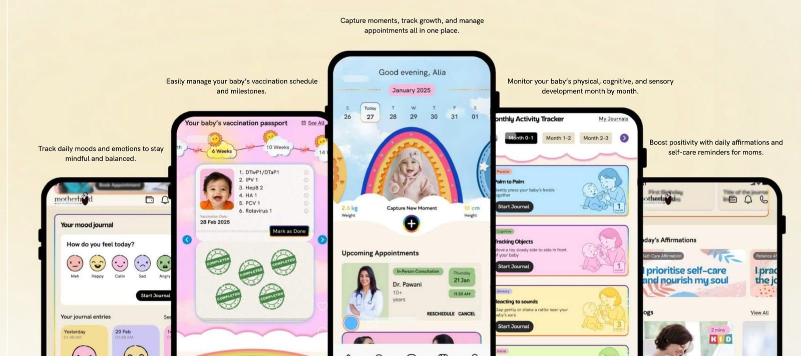
Mom & Baby carries the structure into early parenthood. It captures growth and everyday moments, manages the vaccination schedule and milestones, and follows the baby's physical, cognitive and sensory development month by month, while keeping space for the mother's own wellbeing.
IVF
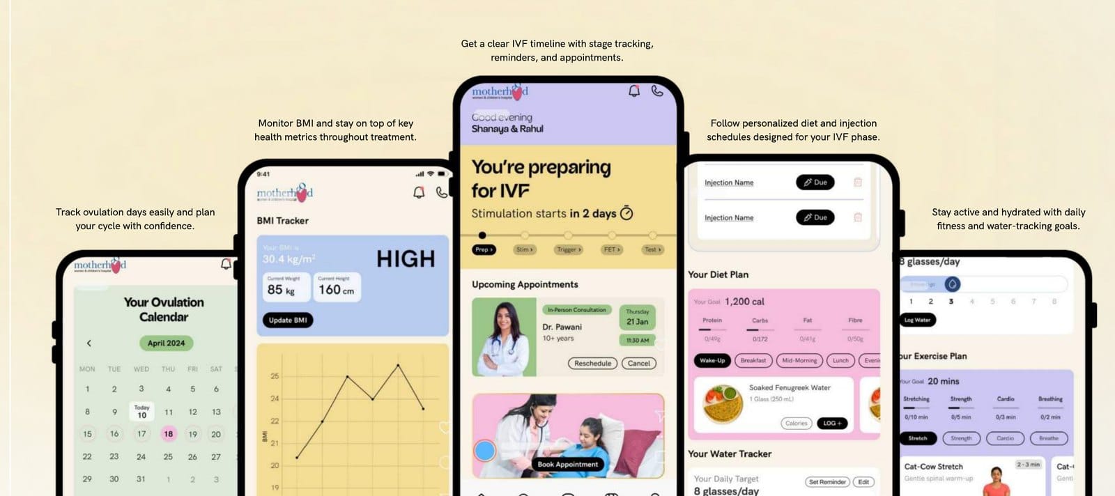
IVF gives couples a clear picture of a demanding process. A stage-by-stage timeline sets out where they are with reminders and appointments, injection and diet schedules are tailored to each phase, and everyday tracking covers the cycle, health metrics and fitness.
What I took forward
Designing a healthcare product extends well beyond its screens. Clinical collaboration, prototype feedback, original content production, content management and routes back to care all shape the delivered experience.
The work also meant connecting two needs: making support approachable enough for everyday use, while preserving the boundaries where professional attention matters. Following Maternity's successful run, I built the Mom & Baby and IVF verticals, and Courses later expanded the same experience with structured lessons, quizzes, progress and certificates.
Thanks for reading.